Get the full picture on your AI adoption and impact.
We'll show you exactly how AI is impacting your speed and code quality.


Burndown Chart: What Engineering Leaders Should Know About Sprint Delivery Visibility
Introduction
A burndown chart is a visual Agile project tracking tool that shows how much work remains versus time. Using a burndown graph, the team can easily predict whether they will complete planned work within a sprint or release timeline. Also called a burn chart, it compares remaining work against time elapsed. If the remaining work declines steadily, the sprint is on track. And if it doesn't, there could be potential delivery risk.
Why Burndown Charts Still Matter (And Where They Fail)
Picture a familiar week in an engineering organization.
The board asks, "How confident are we about delivering this quarter?"
Product wants a firm date for the next release.
And team velocity has been very fluctuating for the three sprints. The worst thing was, last sprint goal was missed without any warning.
Everyone is looking at the engineering leader for answers. This is precisely a situation when a burndown chart is supposed to help. But its ability to help a leader fully depends on whether the person reading it understands what it actually measures, and more importantly, what it does not.
Burndown chart is one of the oldest Agile visibility tools. It has been part of Agile delivery practice since the early days of Scrum. Almost every engineering team has burndown charts running automatically inside Jira, Azure DevOps, or whatever tool manages their sprints.
But here's the problem. Most leaders either ignore it... or over-trust it. Both are mistakes.
A burndown graph still matters, as it gives a fast signal about the sprint trajectory. It clearly depicts whether the work is getting burned at the speed that matches the sprint commitment. And this is very useful when you're trying to assess short-term delivery confidence.
But it has limits. It is a flow signal. It simply tells you how work is moving through a sprint relative to the time remaining - nothing more, nothing less.
It is not a productivity metric. A team burning down the work and meeting the commitment of the sprint does not necessarily make it a high-performing team. Similarly, a team with an irregular burn is not necessarily underperforming. The chart shows the movement of committed work. It says nothing about the effort, skill, or output quality behind that movement.
It is also not a performance evaluation tool. Using a burn chart to assess an individual's performance is a common and consequential misuse in engineering leadership.
This Reddit thread discusses a very brutal outcome when teams sense their chart is being used to evaluate them rather than improve delivery.
So, if used correctly, it supports decision-making and short-term forecasting. Used blindly, it creates false confidence and confidence erosion.
What a Burndown Chart Means at the Leadership Level
In sprint-based execution models, teams commit to a set of work for a fixed window of time. From a leadership perspective, this visualization supports key events in Agile frameworks like Scrum.
During daily scrums, it provides an objective snapshot of progress. In Sprint Reviews and Retrospectives, it helps teams and leaders reflect on planning accuracy, variability, and process health. It converts subjective conversations into data-informed discussions.
However, at the leadership level, a sprint burndown chart should be comprehended as a short-horizon execution lens. It does not measure engineering excellence.
Leaders use burndown charts to answer one critical question: Is the team on track to complete what it committed to, based on how work is progressing day by day?
There are mainly 3 types of burndown charts:
1) Sprint burndown chart: Tracks remaining work within a single sprint time box.
2) Release burndown chart: Tracks remaining work across multiple sprints toward a larger release milestone.
3) Product burndown chart: Tracks remaining work across the full product backlog over a longer horizon.
Core components of burndown charts include,
1. Time Axis (X-Axis) - Represents the sprint or release timeline.
2. Work Axis (Y-Axis) - Represents remaining work (story points, hours, or tasks).
3. Ideal Burn Line - A straight line showing expected progress if work burns evenly across the timeline.
4. Actual Burn Line - The real-time line showing how work is actually being completed.
5. Scope Change Indicators (if supported) - Markers that show when work is added or removed mid-cycle.
Beyond this, there is a related concept - the burnup chart.
Unlike a burndown chart, which shows work remaining decreasing over time, a burnup chart shows work completed increasing over time - while also displaying total scope.
The key difference:
- Burndown highlights execution drift clearly.
- Burnup makes scope changes more transparent.
What a Burndown Chart Actually Tells a CTO
A burndown chart is not a dashboard. It does not summarize engineering health or team performance. What it offers is more useful, a set of behavioral signals about how a sprint is unfolding. Here are the four signals worth paying attention to.
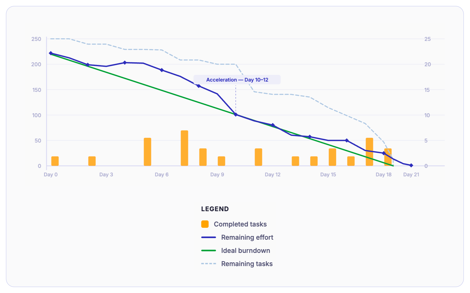
1) Delivery Trajectory
The most basic question the burn chart answers is: whether the team is on track to finish what they committed to?
The ideal line runs straight from the total committed work on Day 1 to the total committed work hitting zero on the last day of the sprint.
The gap between these two lines and whether it is growing or shrinking tells you whether the sprint is being true to the committed time or heading toward a miss.
However, remember - this is about trajectory, not effort. A CTO doesn’t need to know who worked late. They just need to know whether the sprint goal is drifting or meeting.
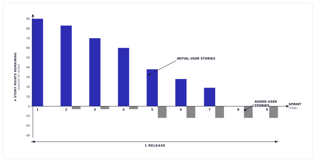
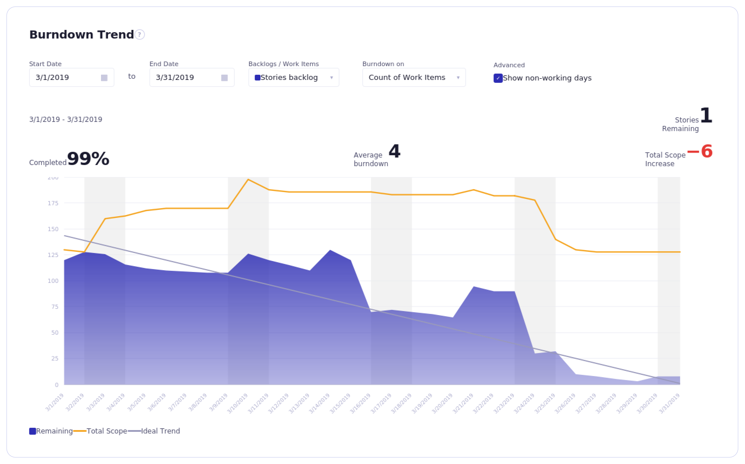
2) Scope Volatility
The burndown line should always run downward. If the line goes up during the sprint, that means new work was added. That’s a scope increase. Occasional adjustment is normal. But frequent spikes create ripples across the engineering pipeline.
Repeated upward signals or scope volatility shows…
- Weak backlog discipline
- Mid-sprint priority shifts
- Unclear sprint boundaries
For leadership, this is a planning stability issue and not a team issue. It should be examined at the process level.
3) Work Completion Behavior
Observe how work closes. Does the line in the burndown graph gradually decline across the sprint? Or does it stay flat and then drop sharply near the end?
A healthy pattern is simple - work closing steadily across the sprint. But when the line closes sharply during the last 48 hours of a sprint is called end-of-sprint compression.
What this usually means is - work is being batched. Work is integrated late. Testing is compressed. ‘Done’ is delayed until the last moment.
Using a burndown chart, leaders can easily spot completion behavior patterns very clearly and make necessary process upgrades.
4) Sprint Commitment Discipline
Leaders must look across multiple sprints to pulse-check the actual reality. Is the team regularly committing to more work than they can finish? Are they regularly missing the sprint by the same amount, five points short, ten points short?
This pattern points to a systemic estimation problem, rather than a one-time execution issue. A CTO who tracks this pattern across six to eight sprints has early, objective evidence that something in the planning process needs revamping.
Because teams may be overcommitting while being ambitious or may genuinely lack the right way to size their sprint capacity.
What a Burndown Chart Does NOT Tell You
Understanding what a burndown chart is all about is equally important to understanding what it is not all about. This is where leadership credibility is won or lost. The chart only sees one narrow slice of delivery, everything outside of that slice is invisible to it.
Sprint Burndown Chart vs Release Burndown Chart: Strategic Implications
Not all burndown charts are the same. There are two major types, and using the wrong type to answer leadership questions leads to the wrong conclusions. A sprint burndown operates at the execution layer. A release burndown operates at the roadmap layer.
1) Sprint Burndown
A sprint burndown tracks work remaining within a single sprint. It resets at the start of every sprint and is most useful at the team and delivery level.
Operational visibility - The sprint burndown chart gives the team a daily check on whether they are on pace to finish what they committed to. If the line is off-track on day 3, there is still time to adjust - drop a story, ask for help, or flag the risk early.
Daily standup alignment - The sprint burndown is the most useful reference point in daily standups. It keeps conversations centered around what is actually happening this sprint and where we are currently standing.
Micro-level flow signal - Sprint burndown graph reveals short-term execution patterns in the form of batching, scope additions, and estimation misses. It helps Engineering Managers and Tech Leads detect drift early.
2) Release Burndown
Unlike a sprint burndown chart, a release burndown chart spans multiple sprints. It tracks remaining work across a larger initiative or milestone. And because of that, it does not reset with each sprint.
Roadmap predictability: Release burndown chart gives product and leadership a view into whether the release is trending toward its target date. If the scope keeps getting added and the line is not moving fast enough, the release date is at risk.
Milestone confidence: When a VP or CPO asks, "Are we going to hit the Q3 milestone?" a sprint burndown cannot answer that question. A release burndown can, because it is tracking the same, the larger picture, milestone.
Portfolio-level risk: Across multiple teams or workstreams, release burndowns help engineering leaders identify which initiatives are on track and which are drifting. This makes it a more useful input for quarterly planning conversations, stakeholder updates, and roadmap adjustments.
How to Read a Burndown Chart Like an Engineering Leader
Needless to say, but if you’re leading an engineering organization, the more useful skill is pattern recognition, and it is all about knowing what a particular shape of the burndown line is telling you about team behavior, process health, and delivery risk.
Here are the four patterns that matter most when it comes to reading a burn chart.
Pattern 1: Flat Early, Sharp Drop Late
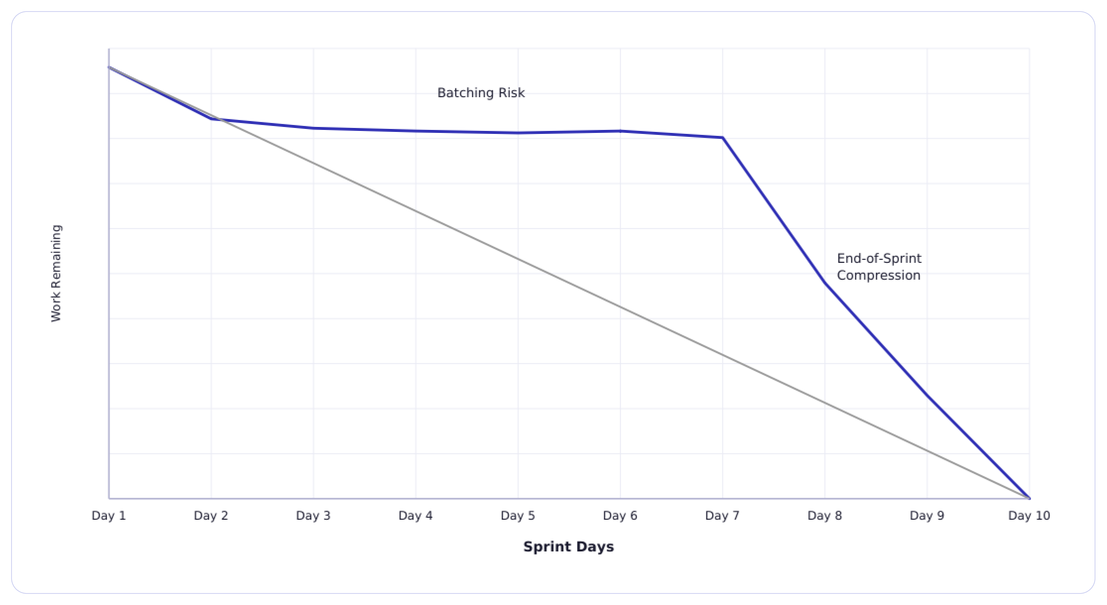
The line hardly moves for the first half of the sprint, then falls steeply in the last two or three days.
Pattern 2: Upward Scope Adjustments
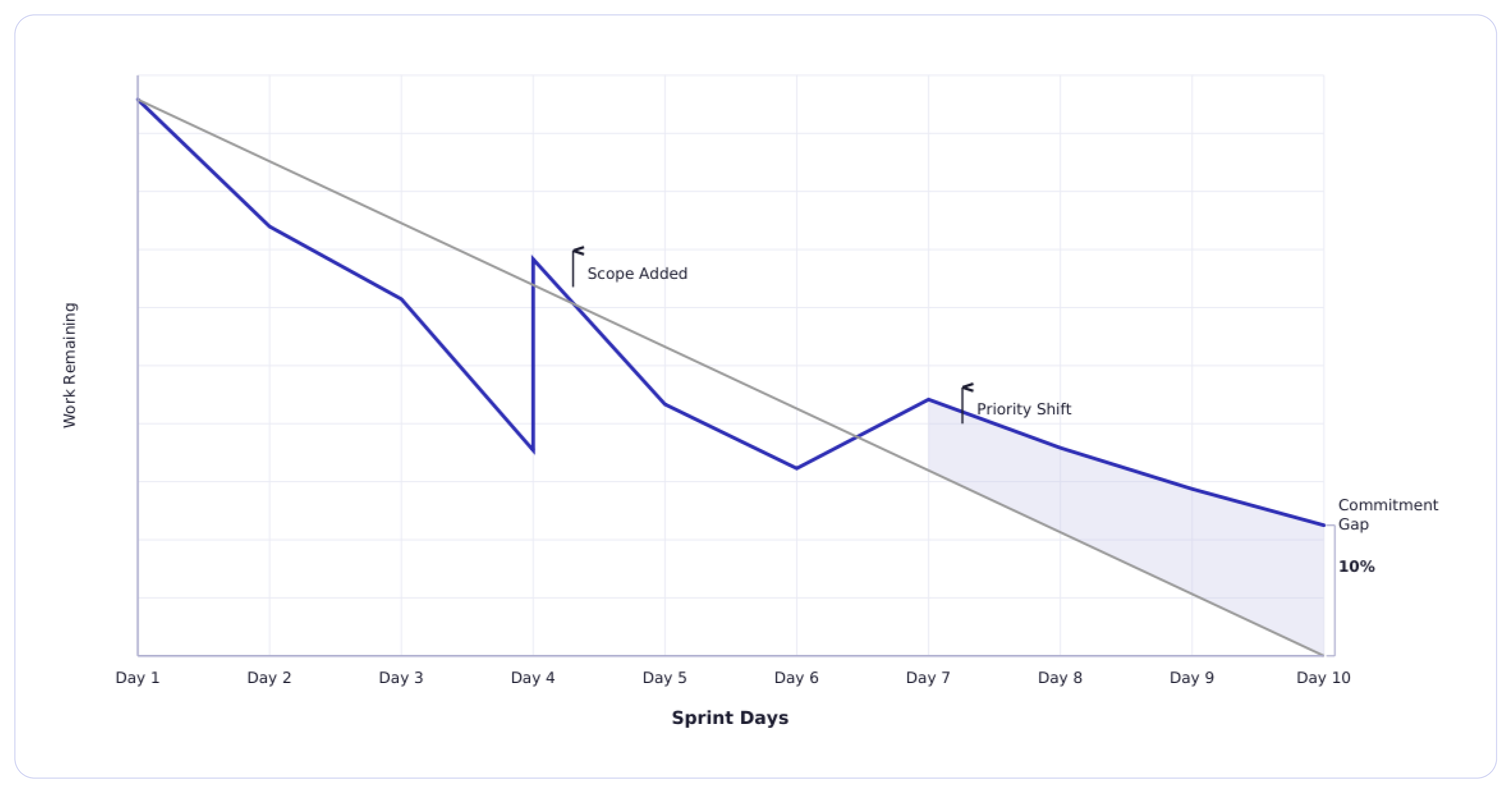
The line in the burndown graph drops for a few days, then again jumps upward before resuming its downward path.
Pattern 3: Smooth Linear Burn
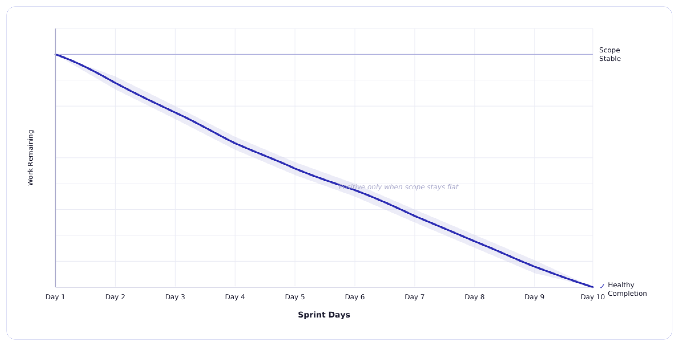
A steady, consistent decline from Day 1 to near zero by the end of the sprint.
Pattern 4: Consistently Missing the Ideal Line
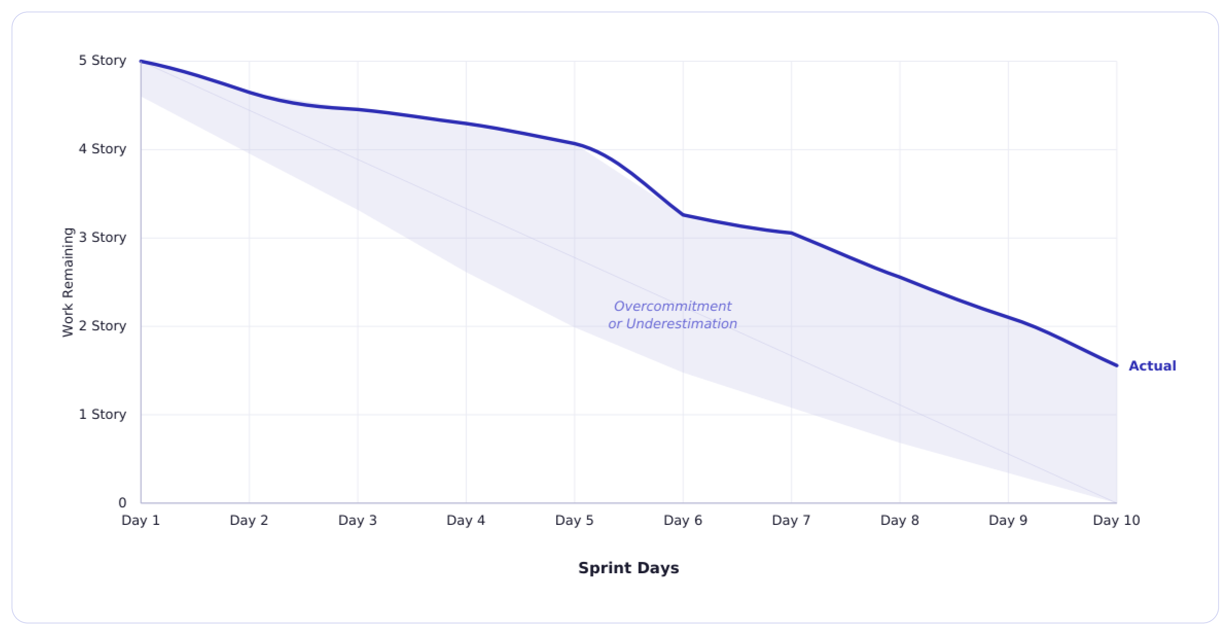
The team regularly finishes below the ideal trend. In other words, the actual line in the burndown graph runs above the ideal line and does not reach zero by the end of the sprint.
The Burndown Chart in Modern Tooling Ecosystems
In most engineering teams, burn charts are built within workflows. Tools like Jira and Azure DevOps automatically generate sprint burndown charts the moment a sprint begins. And as stories move to Done status, the line drops. If scope changes, the burn chart adjusts automatically.
From a tooling standpoint, this is very powerful.
You get,
- Real-time updates
- Automated remaining work calculations
- Ideal burn comparisons
- Historical sprint visibility
But here is the irony. Tooling makes burn charts to generate easily. It does not make them easy to interpret. Burndown graphs in modern tooling ecosystems are execution telemetry. They show surface-level sprint behaviour.
How Jira and Azure DevOps Actually Use Burndown Data
In Jira, the burndown chart is tightly connected to story points and sprint scope. It shows estimation accuracy and workflow discipline. If tickets stay in "In Progress" too long, the chart flattens. If work is closed in batches, you see sharp drops.
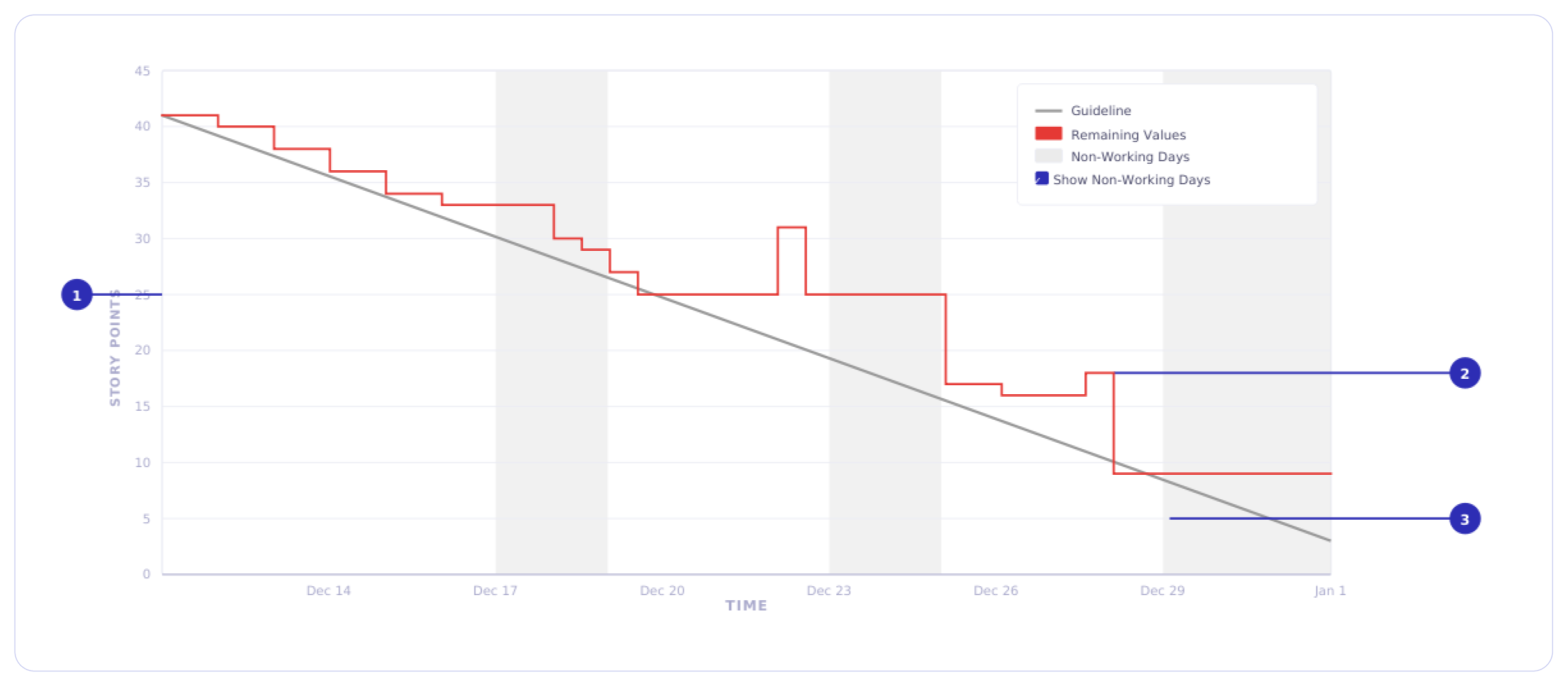
In Azure DevOps, dashboard widgets and in-context reports provide a burndown chart. This shows remaining work over the sprint. You can configure them based on work items, story points, or remaining work fields. The chart includes an ideal trend line and the actual progress based on how work items are updated day by day. It also shows additions or removals of work items.
In both systems, the chart is only as clean as your workflow definitions.
If:
- “Done” is loosely defined
- Stories are oversized
- Scope changes mid-sprint without discipline
- Work is split inconsistently
The burndown becomes a wrong signal.
The Illusion of Dashboard Confidence
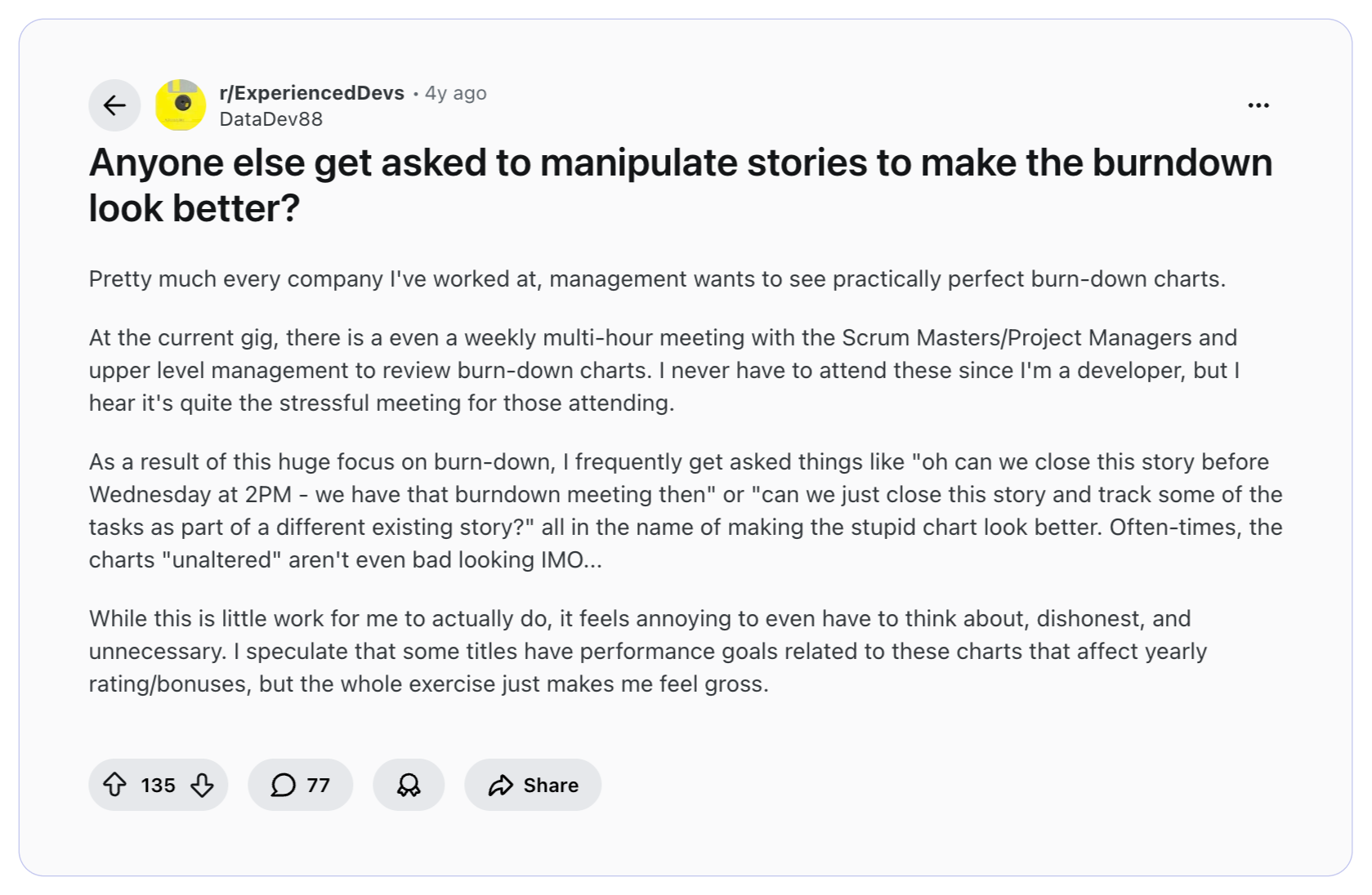
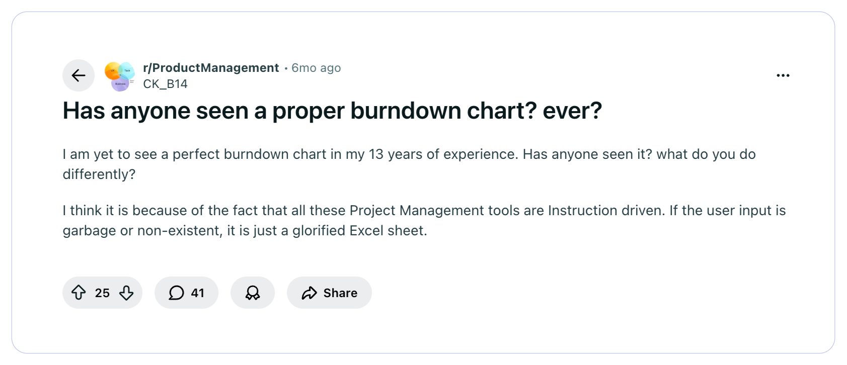
In this Reddit thread, the Redditor asked a burning question - Has anyone seen a proper burndown chart? Ever? What he elaborated further was the clean reality. He said, project management tools are instruction-driven. If the user input is garbage or non-existent, it is just a glorified Excel sheet.
Contrary to what was stated in the above Reddit thread, many engineering leaders pursue dashboards filled with metrics in their raw form only. They think they have the ultimate visibility into delivery, but they fail to squeeze out the actual insights from those metrics.
A burn chart in Jira does not know whether late drops mean integration risk. Azure DevOps does not flag estimation bias across five sprints.
These tools show movement. Leadership must extract meaning. They must question and get answers to…
- Is this a planning issue or a flow issue?
- Is this estimation noise or systemic overcommitment?
- Is this sprint drift isolated or repeating?
Answering these questions separates operational reporting from true engineering intelligence.
When Burndown Charts Create False Confidence
An agile burndown chart that looks healthy can still be hiding serious delivery bottlenecks. And this creates a dangerous illusion. The following are the four ways an agile burndown chart can create false confidence.
Risk #1: Estimation Bias
Before planning any sprint, the scrum master uses story points to estimate the total effort required to complete that sprint. However, a five-point story in one sprint is not about the same effort as a five-point story in the next sprint. Because teams work on different challenges and tasks in every sprint. They rarely work consistently across all sprints. Thus, taking past completed sprints as a baseline to estimate efforts or story points for the next sprint is a big risk, often leading to underestimation or overestimation.
Risk #2: End-of-Sprint "Done" Compression
This is one of the most common and least discussed patterns in sprint execution. Stories sit in review, in testing, or near-done status for most of the sprint time. And then suddenly, 24-48 hours before the sprint nearing the end, everything gets marked done. So, when any leader sees a burndown chart, the chart tells them that the sprint looks successful. But the underlying reality of the team compressing all their integration, review, and verification work into the final stretch never gets surfaced. The chart recorded completion. It did not record risk.
Risk #3: Gaming Behavior
Michael Akinkunmi, Senior Scrum Master, based in Atlanta, USA, wrote in his LinkedIn post that the agile burndown chart can easily be gamed. He claimed that he has seen teams break down work into tiny story points or roll tasks into the next sprint - just to make the chart look "good" on paper. This is not malicious. It is a natural human response when they know they are being measured. But the result of such practice creates false confidence. When leaders see the charts, what they pursue is far distinct from what is happening in reality.
Risk #4: Ignoring Flow Metrics
An agile burndown chart does not show key flow metrics - ones that show how work actually moves through your system.
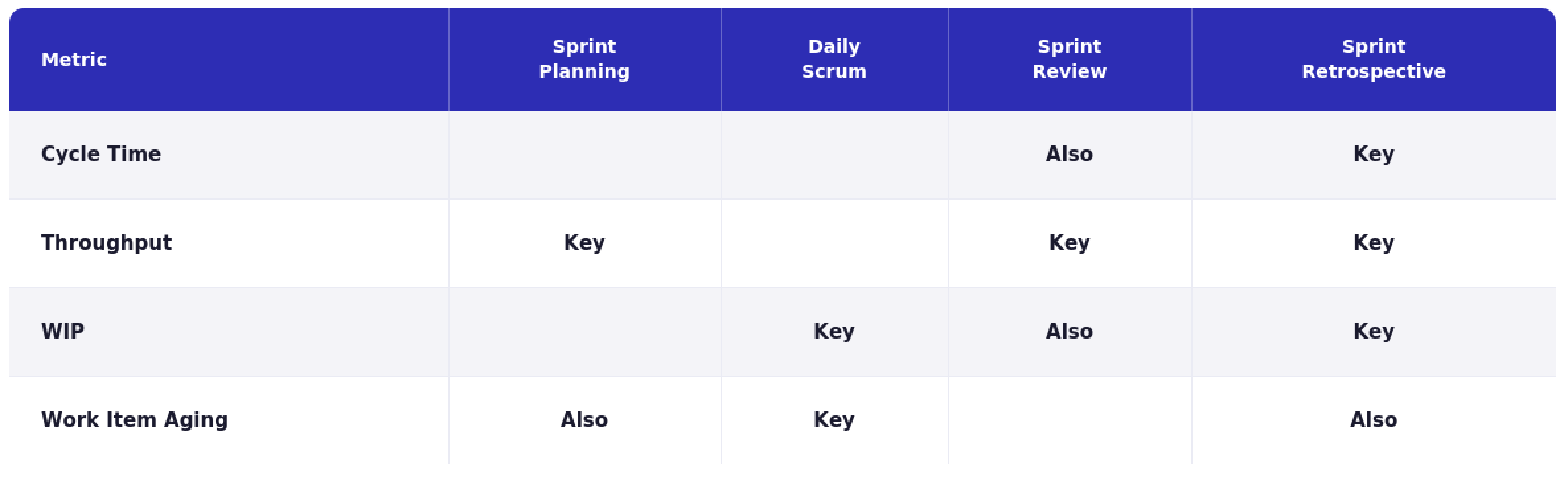
To understand this, consider the flow metrics defined in the Kanban Guide for Scrum Teams and discussed by Scrum.org:
- Work in Progress (WIP) - Number of work items started but not finished. This metric reveals how much unfinished work is stuck in the system.
- Cycle Time - The elapsed time between when a work item starts and when it finishes.
- Throughput - Count of work items completed in a given period. This shows how much value is delivered.
- Work Item Age - How long an active item has been in progress. This reveals items that are stalled, and are there any bottlenecks?
- Deployment frequency - Part of DORA metrics, it shows how often code reaches production.
- Lead Time for Changes - Prominent flow efficiency signal, from DORA metrics, this shows the percentage of deployments that cause incidents or require hotfixes.
The following image maps key flow metrics across Scrum events. In other words, it shows the importance of each flow metric to include, measure, and track across Scrum events.
Burndown Chart vs Engineering Intelligence
Burndown charts in Scrum and engineering intelligence operate at different altitudes. A burndown chart helps you manage a sprint. Engineering intelligence helps you manage the system. Here’s a detailed comparison.
How Engineering Leaders Should Operationalize Burndown Charts: Best Practices & 3L Framework
Burndown charts provide visibility. Leaders must convert that visibility into execution control. Here are some best practices.
To make more value out of the burndown chart, engineering leaders can use this 3L framework.
Level 1 - Local (Sprint Execution):
Question: Did we finish what we committed to?
Primary tool: Burndown chart.
Focus: commitment integrity, scope stability, completion behavior.
Level 2 - Flow (Delivery Efficiency):
Question: Is work moving smoothly through the system?
Primary signals: Cycle Time, Work in Progress (WIP), Throughput. This reveals bottlenecks and systemic drag.
Level 3 - Live (Production Reliability):
Question: Are we delivering value safely and consistently?
Primary signals: Deployment Frequency, Change Failure Rate, Mean Time to Restore.
This shows delivery capability in the real world.
Conclusion: Where Burndown Fits in a Modern Engineering Organization
The burndown chart has earned its place in the Agile delivery model across engineering teams. It is simple, accessible, and when read with discipline, it shows real signals about how a sprint is unfolding. For teams running two-week cycles, it remains one of the fastest ways to identify execution risk before they miss the commitment.
But it was designed for a different era of engineering. It answers the primary question of whether a team finished their sprint. The questions engineering leaders today ask and seek answers to are much bigger and deeper. Delivery predictability at scale. System stability under pressure. The connection between engineering output and business outcomes. The burndown chart was never meant to answer these questions.
"Here is what nobody says out loud in sprint reviews, a clean burndown chart is the easiest thing to produce and the least reliable thing to trust. Teams learn quickly what the chart needs to look like. What they rarely have is a leader asking the harder question: are we actually getting better, or just getting better at looking like we are? Airspeed is easy to read. Altitude takes a layered measurement thinking (and the right tool) to check." — Sudheer Bandaru, Co-Founder and CEO of Hivel
Frequently asked questions
Is a burndown chart a productivity metric?
No. Treating the burndown chart as a productivity metric is one of the most common misunderstandings in engineering leadership. A burndown chart tracks whether committed work is completed within a sprint. It says nothing about the effort behind that work, the quality of what was built, or the capability of the team that built it.
Should CTOs rely on burndown charts for forecasting?
A sprint burndown is a short-horizon execution signal. It tells you what is happening inside a two-week window. For release-level or roadmap-level forecasting, a release burndown chart is more appropriate. But even release burndown graphs need to be contextually correlated with historical velocity data, scope stability trends, and team capacity signals.
Why does my burndown line go up?
This may be due to work being added to the sprint after it started. Every upward movement in a burndown line means the scope increases. An occasional upward spike is normal and manageable. But a line that moves upward repeatedly depicts a backlog discipline problem.
Is burndown still relevant in AI-assisted development?
Yes, but its limitations are more exposed than ever. As developers use AI tools to write code faster, sprint velocity becomes even less consistent and harder to use as a stable baseline. A story that used to take 4 hours may take 40 minutes today. This changes estimation, capacity planning, and what a healthy burndown looks like. The chart still remains useful, but AI makes the gap between story completion and actual delivery value widen further.
What's better: burndown or burnup?
Neither is universally better. Burndown shows remaining work decreasing over time — simple and highlights execution drift clearly. Burnup shows completed work against total scope — makes scope changes more transparent. If scope changes more often, burnup provides clearer visibility. If scope is stable, burndown is clean and effective.

Reveal Invisible Roadblocks
Uncover hidden productivity bottlenecks in your development workflow
Review Efficiency
Streamline code review processes to improve efficiency and reduce cycle times


"The only tool our entire leadership team actually trusts"


