We'll show you exactly how AI is impacting your speed and code quality.



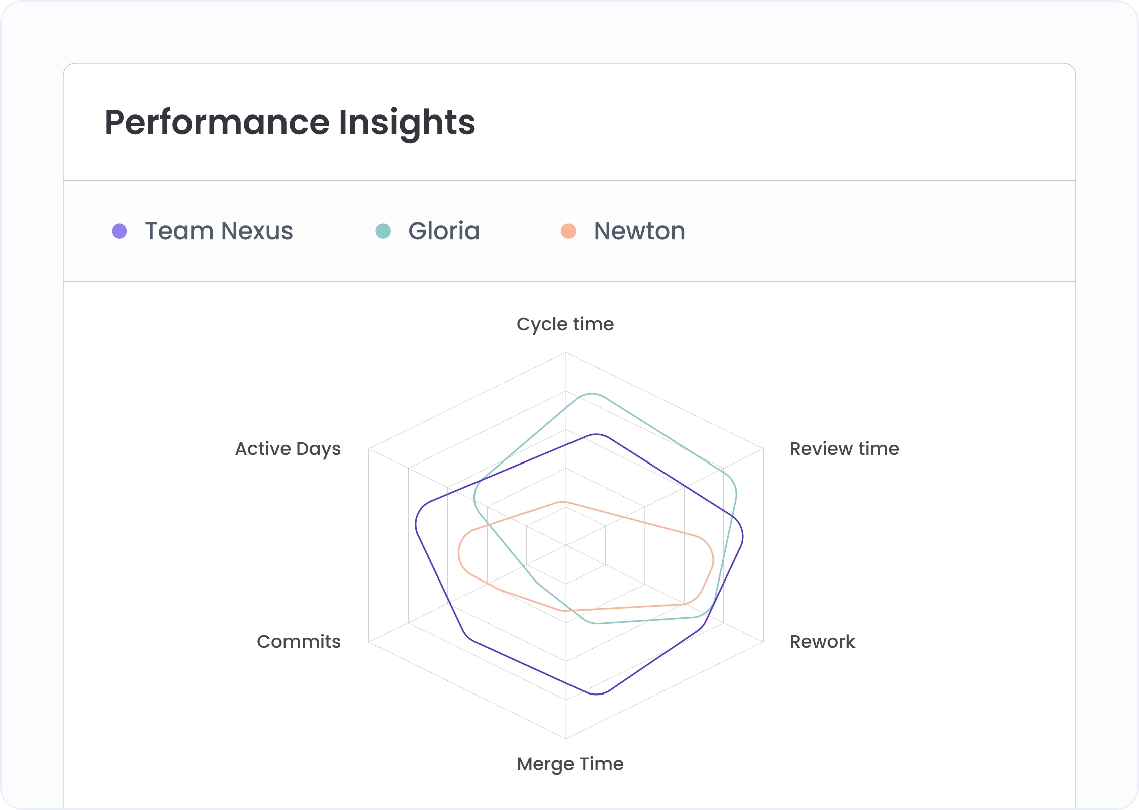
Add up to three developers. Polygons overlay instantly. Where shapes overlap, performance is comparable. Where they diverge, you see exactly which metric and by how much. Fast-but-shallow looks nothing like slower-but-thorough on this view.

Plot a developer alongside their team's aggregate. A 6-day cycle time against an 8-day team average tells a very different story than the same number against the team's fastest coder. Context makes appraisals fair.

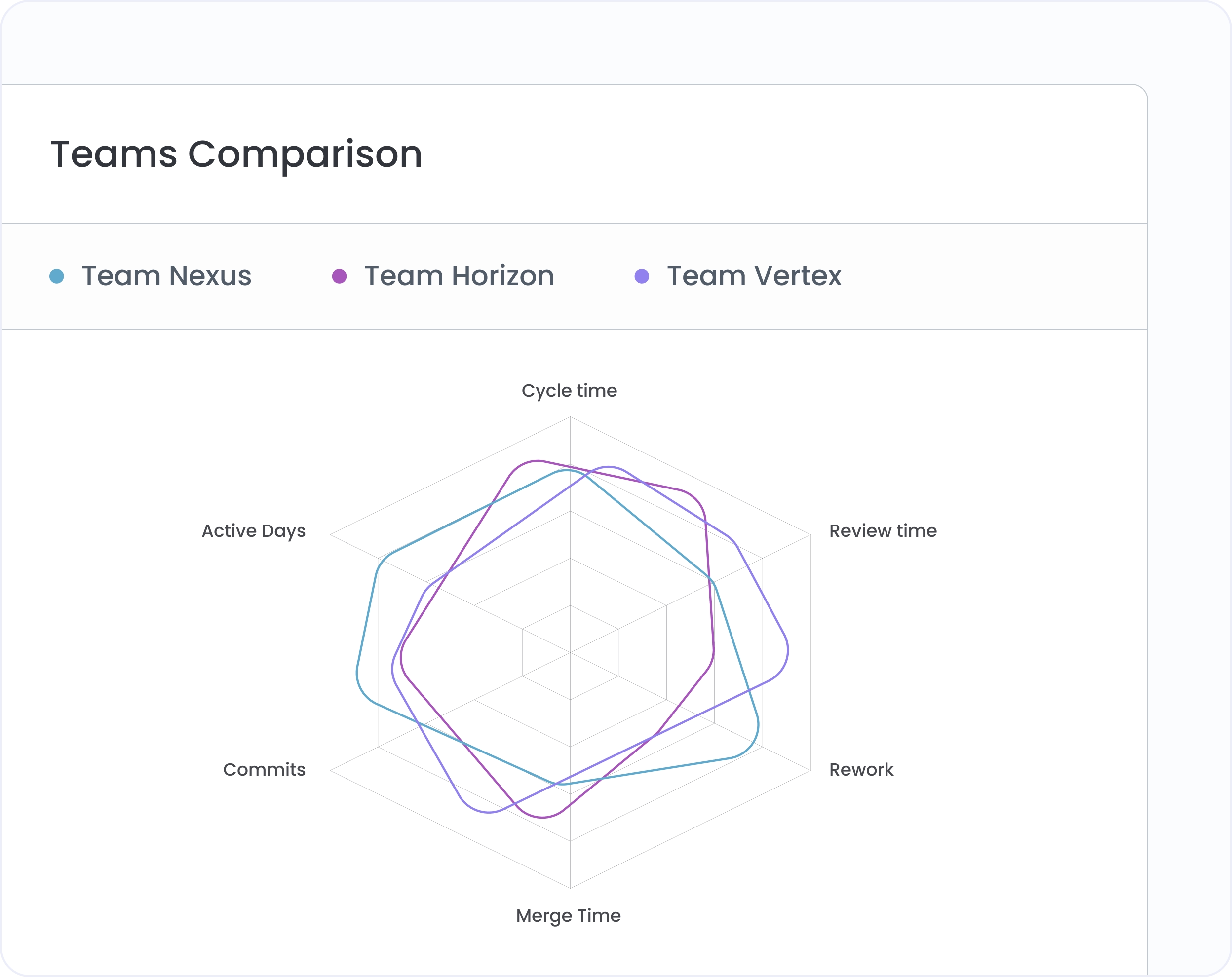
Compare two or three teams' aggregate profiles side by side. High review time isn't always slow. It might mean larger PRs or stricter standards. The chart surfaces the pattern. The conversation explains it.
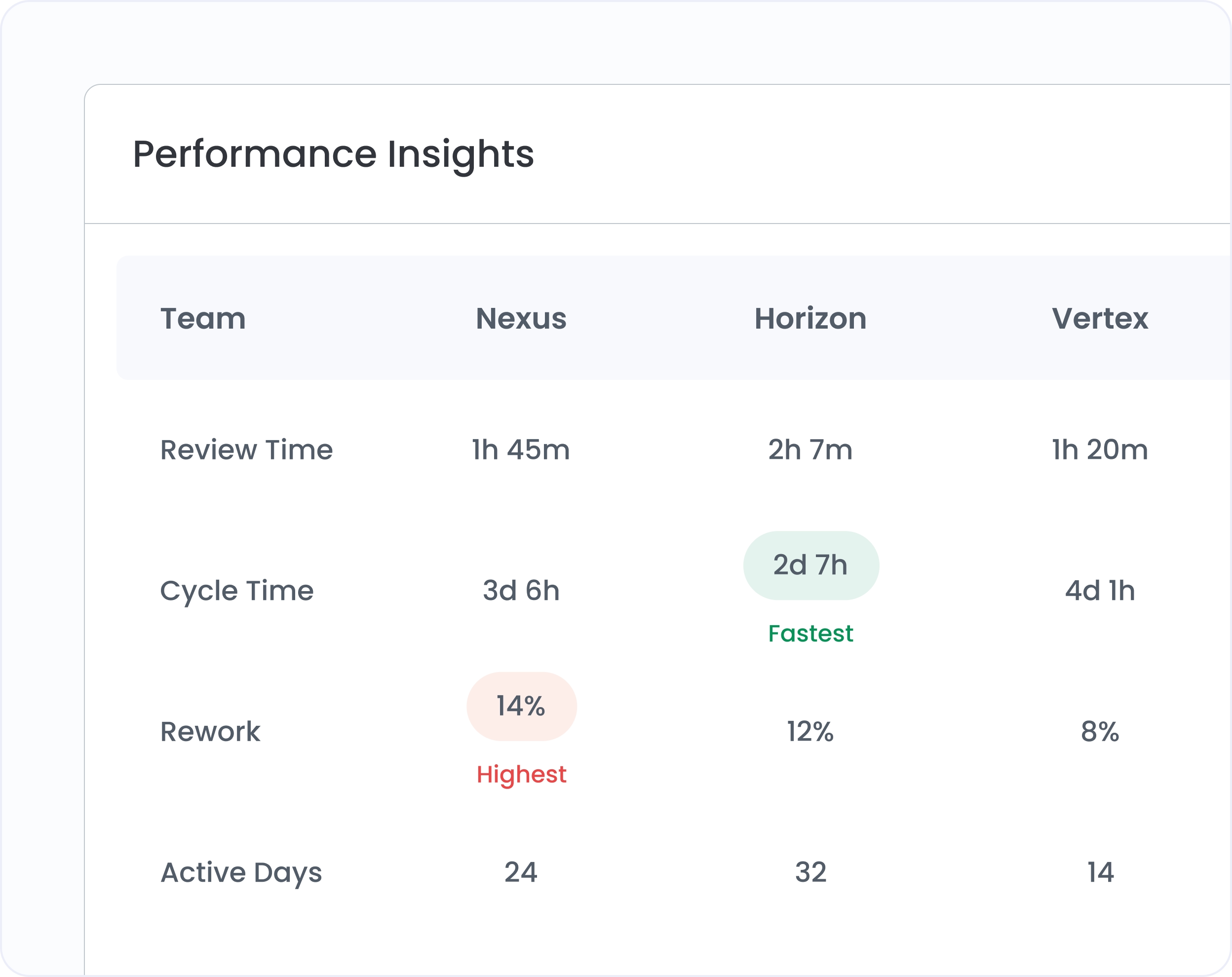
The chart shows the shape of performance. The table shows the numbers. Switch views without losing your selection. Same developers, same metrics, now sortable. Sort by review time to find your most thorough reviewers.
Choose which metrics appear on the chart axes: cycle time, coding time, review time, merge time, commits, PR open count.
Click any name in the legend to isolate that polygon. Useful when three overlapping shapes make individual profiles hard to read.
Add any combination of individual developers and team aggregates in the same view. Compare a developer to their team. Or two teams.
Scope the comparison to a specific workspace or project area. Useful when developers work across different repos with different contexts.

Up to three. You can mix individuals and teams in the same chart. One developer, one teammate, and their shared team average can all appear in a single view.
Yes. Add the developer as an individual and their team as a team entity. The chart shows both polygons together: the individual's profile against the team's aggregate. Outperformance and underperformance both become visible.
Cycle time, coding time, review time, merge time, commits, and PR open count. Choose which three or more appear on the chart axes. Change the selection at any time without losing your comparison.


.svg)
.png)