We'll show you exactly how AI is impacting your speed and code quality.



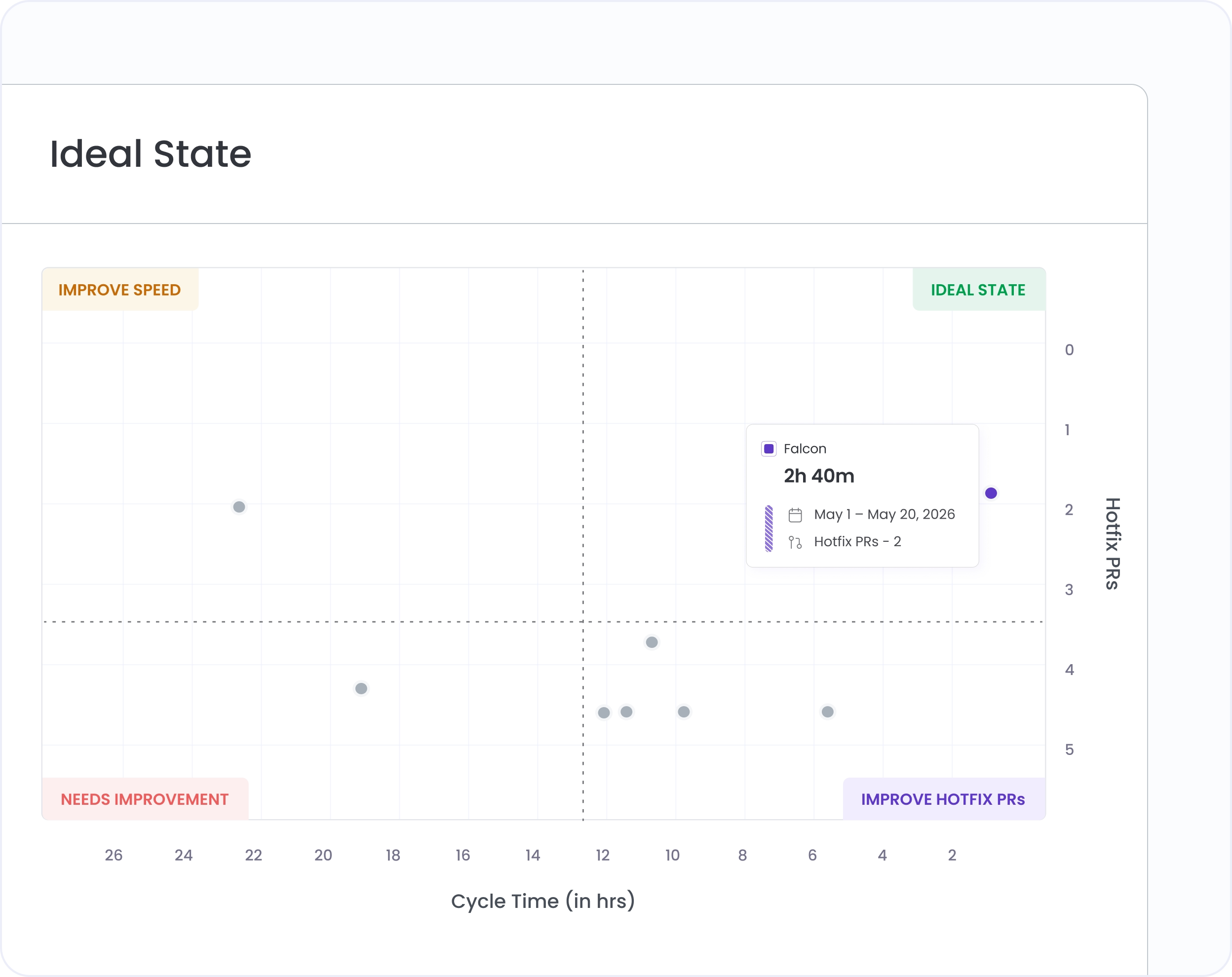
The "Ideal State" quadrant shows teams that are above the org average on both speed and quality. These are your reference points for what good looks like right now. Hivel Quadrant makes them visible so you can understand the pattern and replicate it.
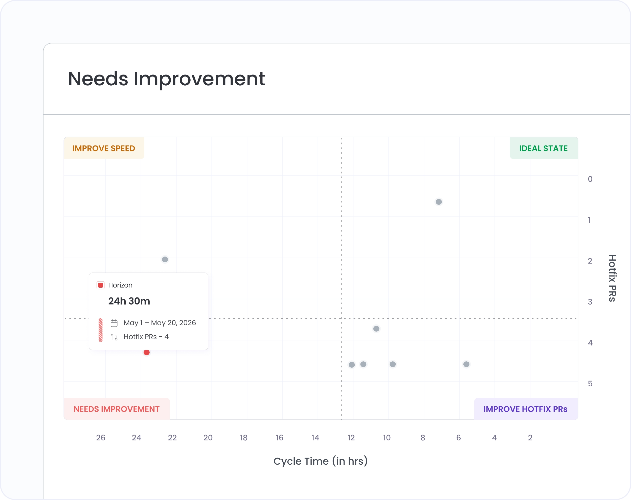
Teams in the "Needs Improvement" region are below the org average on every metric tracked. Hivel Quadrant puts them in plain sight so you can prioritise coaching conversations before the gap compounds.
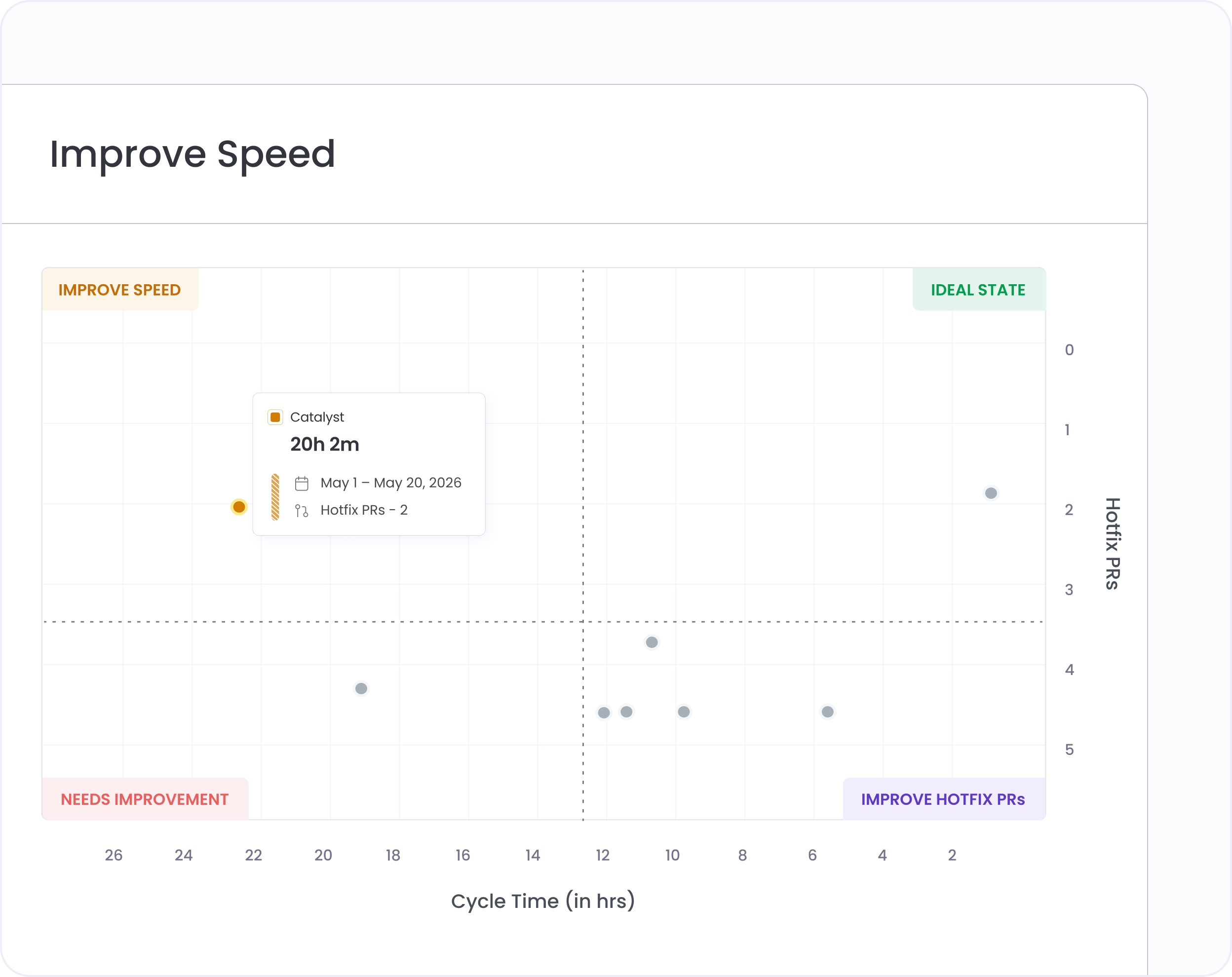
Most teams aren't failing on everything. They're in the "Improve" zone, shipping quickly with poor quality, or producing clean code that takes too long to get out. Hivel Quadrant separates these cases so you're coaching the right thing.
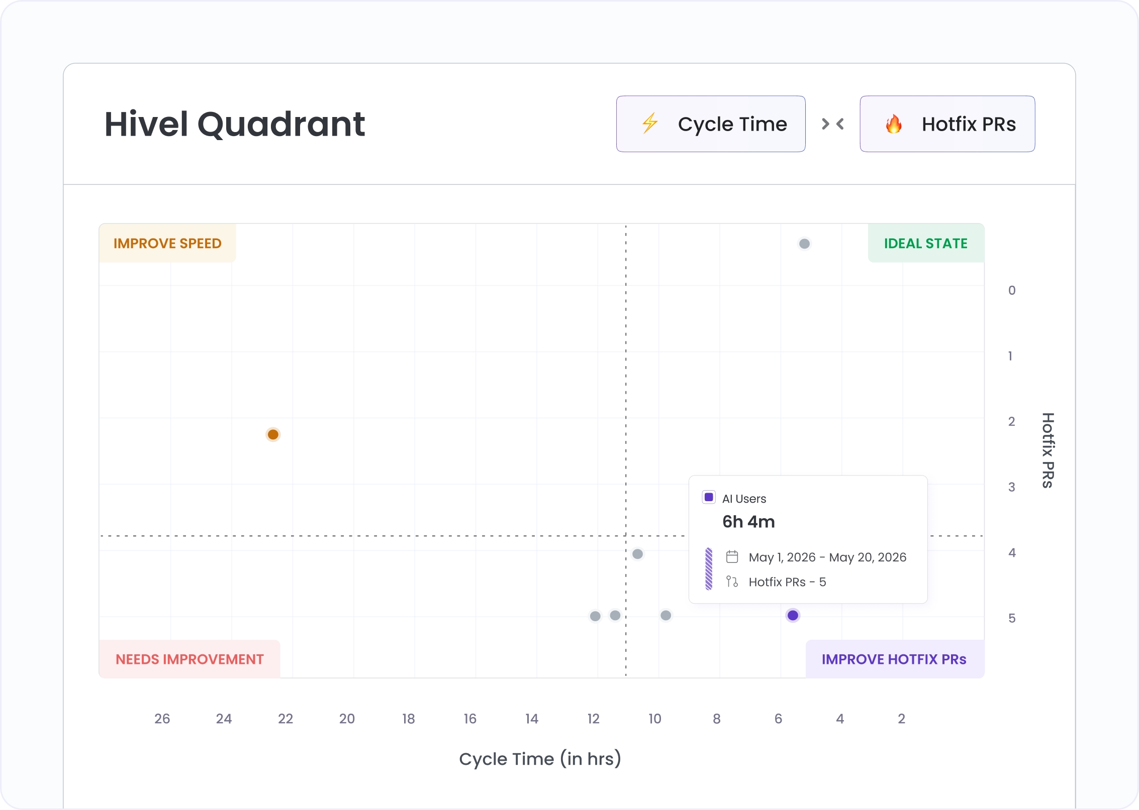
Hivel Quadrant isn't fixed to one pair of metrics. Switch the axes between Cycle Time, Hotfix PRs, and Deployment Frequency to look at your org from a different angle. A team that looks fine on speed and quality might be a throughput outlier. You won't see that until you rotate the view.
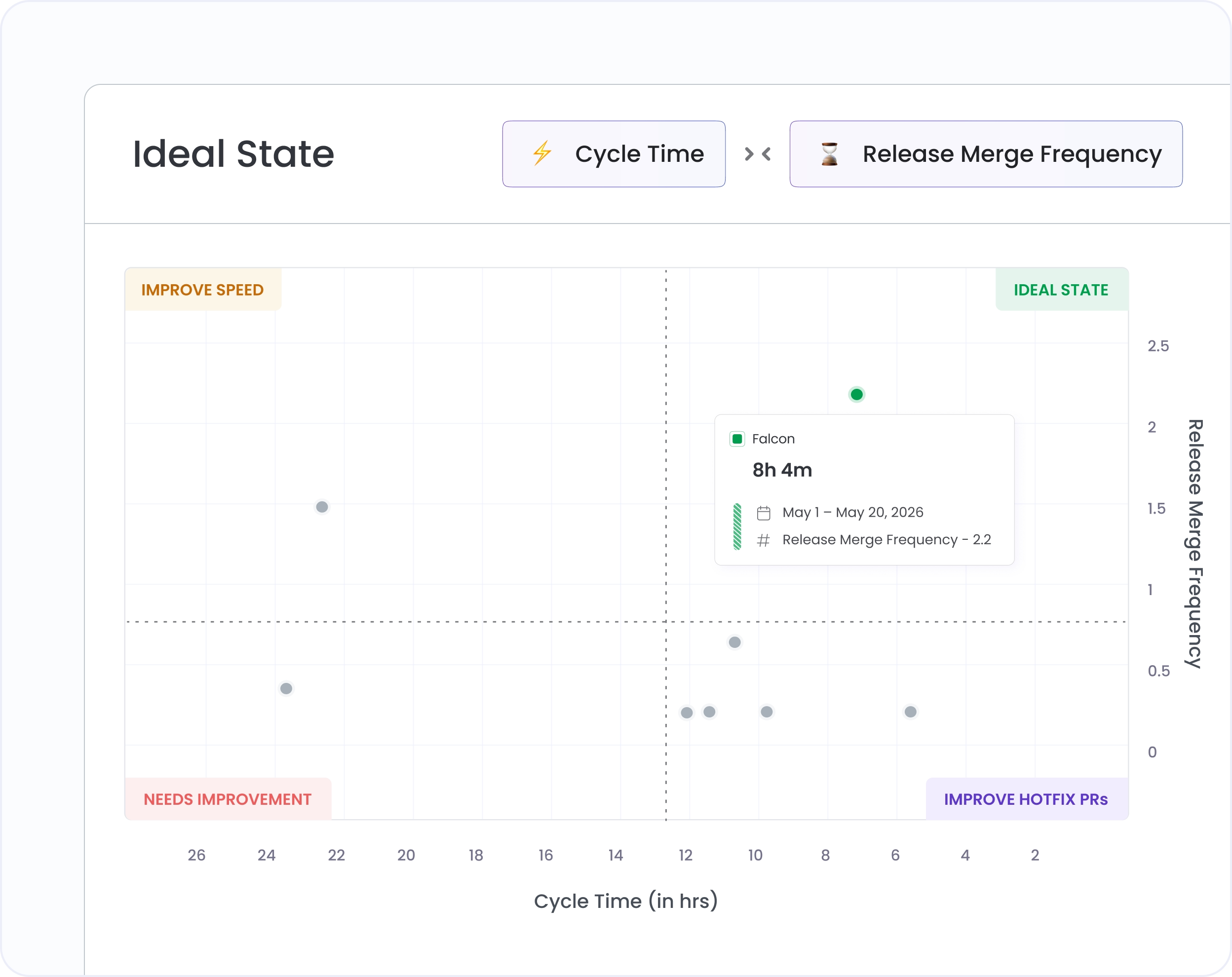
Switch between a team-level view and an individual contributor view without leaving the screen. See where each developer sits relative to the org average on the same axes.
The quadrant axes are anchored to your own org's average, not an external benchmark. That means the view auto-calibrates as your teams improve — the bar moves with you.
Set the time window to the last 30, 60, or 90 days. See if a team that looked fine last quarter has drifted or if a team in "Needs Improvement" is trending toward "Ideal State."
Hivel Quadrant loads in seconds and requires no prep. Drop it on the screen in a leadership review and walk through the distribution without building a deck first.

Hivel Quadrant plots teams and individuals across three metrics: Cycle Time (speed), Hotfix PRs (quality), and Deployment Frequency (throughput). You choose which two to display on the axes at any time.
The axes are anchored to your org's own average, not an industry benchmark. A team in the "Ideal State" region is performing above your org average on both axes. A team in "Needs Improvement" is below average on both. The two "Improve" regions flag teams that are strong on one dimension but lagging on the other.
Yes. The view toggles between team-level and user-level. Individual contributors are plotted on the same axes against the same org average, so you can see exactly where each developer sits relative to their peers.


.svg)
.png)