We'll show you exactly how AI is impacting your speed and code quality.



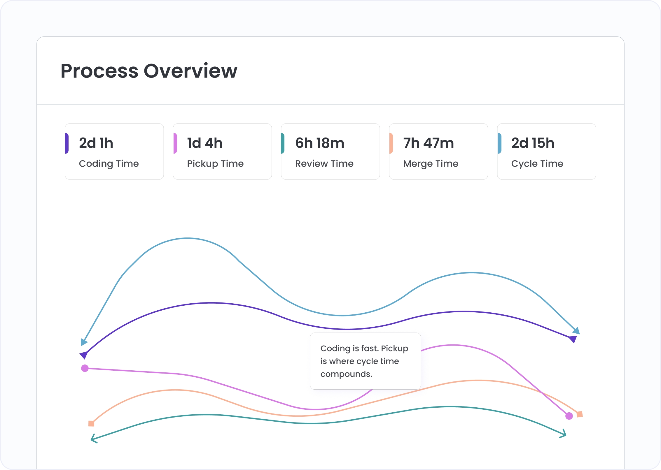
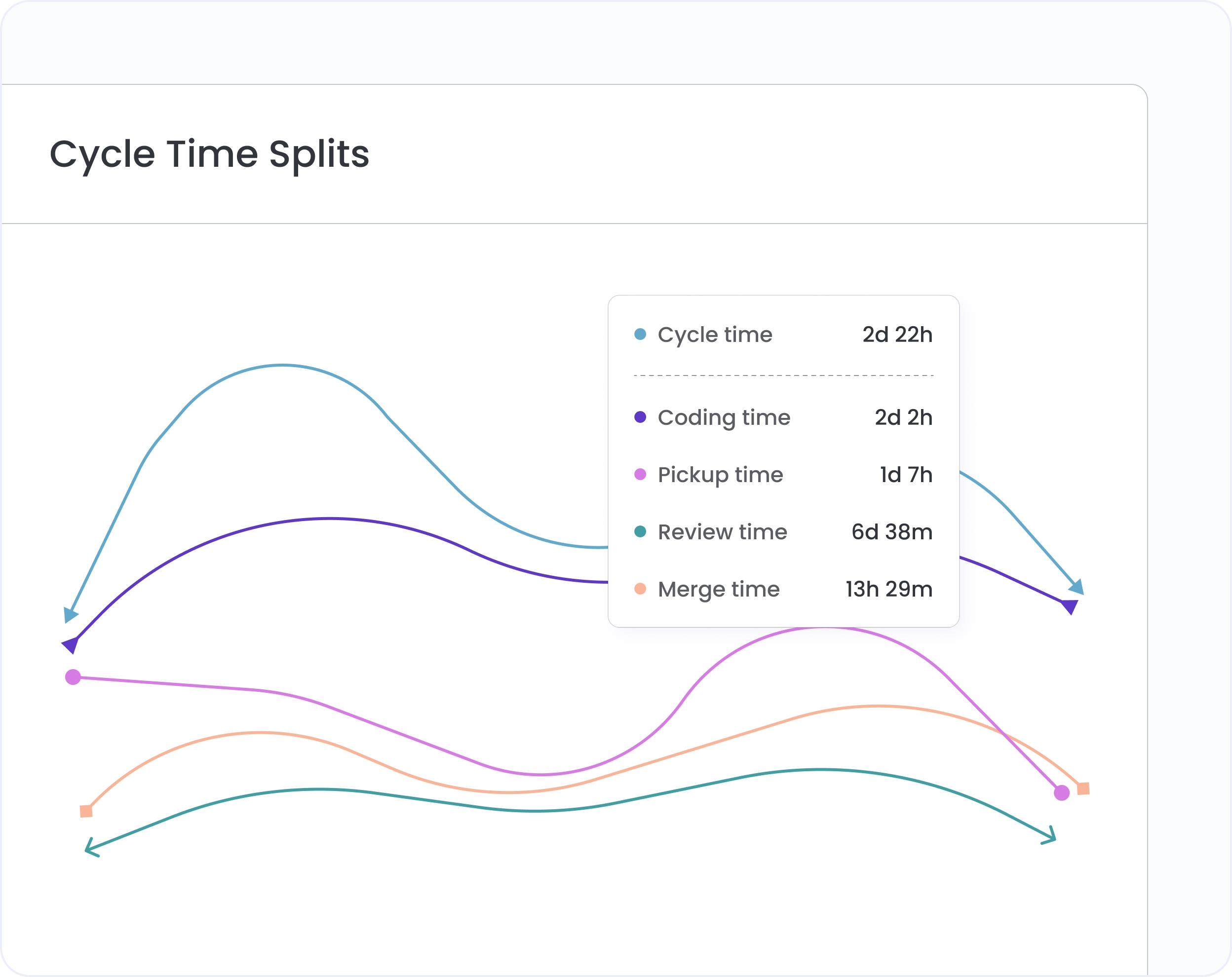
The stacked column chart shows how each week's cycle time splits across coding, pickup, review, and merge. The tallest bar is the one to fix first.
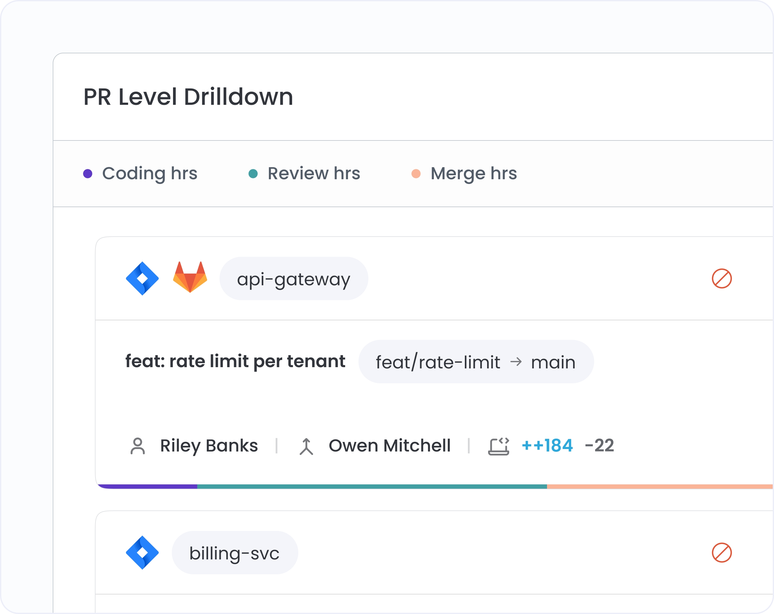
Click any bar and the PRs behind it appear instantly: author, time per stage, linked ticket. Retrospectives stop running on memory and start running on evidence.
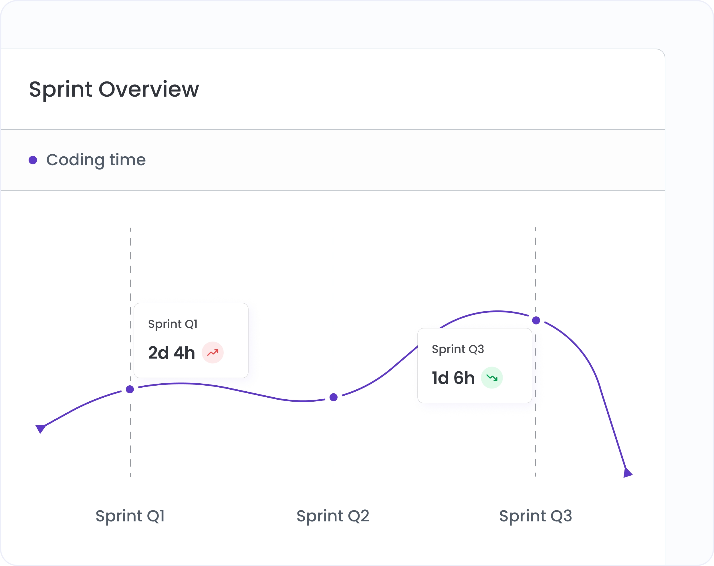
Filter to any sprint window. Every stage measured, every PR accountable. See whether retro actions actually moved the numbers, or whether the same bottleneck is compounding sprint over sprint.
Connect CI/CD and two more stages appear: merge to deploy and total lead time from first commit to production. DORA Delivery Lead Time, drillable to the PR.
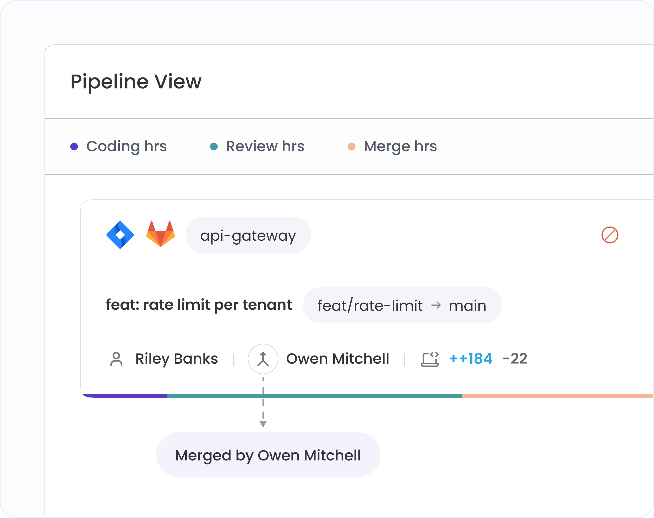
A known outlier skewing averages? Exclude it from the chart in one click. All metrics update immediately. Reinstate from Settings.
Filter to any sprint or named release. Compare sprint over sprint to track whether retro actions actually moved the numbers.
Filter to a single developer to see their personal stage breakdown. Spot where they're the bottleneck vs. where they're waiting.
Scope the view to specific branches, labels, or workspaces. Isolate main branch delivery or compare release branches against development.

Yes. Filter to any date range, sprint window, or named release cycle and the chart rebuilds around that period. Compare sprint over sprint or quarter over quarter in the same view.
A primary use case. Filter to the period you're presenting and Process Flow gives a stage-by-stage picture of delivery performance, with the PRs behind every number available one click away.
Exclude it directly from the chart. All metrics update immediately. Reinstate from Settings at any time.


.svg)
.png)