Get the full picture on your AI adoption and impact.
We'll show you exactly how AI is impacting your speed and code quality.


Engineering Delivery Metrics: How to Measure Throughput, Flow, and Predictability
What Engineering Delivery Metrics Actually Measure
Engineering delivery metrics are quantitative signals that reveal how reliably and efficiently your engineering organization moves work from idea to production. The best definition is a functional one: they tell you how fast value flows, how stable that flow is, and how predictable it is sprint over sprint.
That three-part definition matters. Speed without stability produces outages. Stability without speed produces backlog debt. Both without predictability produce missed commitments and planning chaos. Measuring all three in combination is what separates delivery intelligence from dashboard theater.
The Two Things Every Metric Is Actually Measuring
Strip away the naming conventions and every engineering delivery metric is measuring one of two things: flow (how work moves through your system) or quality (how much of that work stays intact after it ships).
Flow metrics tell you where time goes and where it gets stuck. Quality metrics tell you whether speed is real or borrowed from your future self. You need both. Teams that track only flow metrics optimize for output. Teams that track only quality metrics optimize for stability at the expense of velocity. Neither is the goal.
The DORA Framework: Still Useful, Now More Complex
DORA (DevOps Research and Assessment, now part of Google Cloud) has been the industry standard for measuring software delivery performance since the publication of Accelerate in 2018. The framework originally identified four key metrics: deployment frequency, lead time for changes, change failure rate, and mean time to restore (MTTR).
In 2024, DORA updated the framework in two important ways. First, it added a fifth metric: rework rate, which measures the percentage of deployments that are unplanned reactive fixes to production issues. Second, it reclassified failed deployment recovery time (formerly MTTR) from the stability category to the throughput category, recognizing that fast recovery directly enables continued delivery flow.
The 2025 DORA report moved even further from performance tiers (Elite/High/Medium/Low) to seven archetypes based on eight dimensions of performance. Engineering leaders should understand this evolution because comparing your team's scores to old Elite/High benchmarks gives you an incomplete picture of where you stand.
When Your Metrics Lie: The Delivery Intelligence Gap
Deployment frequency is up. Sprint velocity is trending in the right direction. The dashboard looks clean. And yet every Thursday standup is a negotiation about what actually makes it into the release, engineering morale is slipping, and your largest customers are still filing bugs against features you shipped two sprints ago.
This is the delivery intelligence gap. The numbers say one thing. The reality says another. And the gap between them is where roadmaps get blown up, engineers get burned out, and engineering leaders lose credibility with the business.
The problem is not that teams are lying. It is that most engineering delivery metrics are measuring the wrong things. Activity gets confused with outcomes. Speed gets confused with throughput. A healthy dashboard score gets confused with a healthy delivery system.
The Activity Trap
Ask ten engineering leaders how they measure delivery performance and you will hear variations of the same four things: story points per sprint, deployment frequency, cycle time, and change failure rate. These are not bad metrics. The problem is how they get used.
When velocity becomes a target, teams inflate estimates. When deployment frequency becomes a goal, teams split changes into smaller deployments without reducing the actual lead time for a feature. When cycle time gets tracked in isolation, teams optimize the PR review step while ignoring the four days the ticket sat in a waiting state before anyone touched it.
Most analytics tools are a waste of money for exactly this reason. They measure activity, not outcomes. You can have a team that looks incredibly busy while delivering nothing of value. The metric tells you the team is performing. The customer experience tells you something different.
What Good Delivery Intelligence Actually Looks Like
Real delivery intelligence connects three things that most organizations track in silos: what the team shipped, how long it took, and whether it held up in production. Getting all three requires measuring across throughput, flow, and predictability simultaneously.
The 2025 DORA State of AI-Assisted Software Development report identified something important: teams that improved throughput through AI adoption also saw delivery instability increase. Faster output without stability monitoring produces a misleading picture of delivery health. You need all three lenses at once.
The Three Measurement Domains: Throughput, Flow, and Predictability
Throughput: How Much Is Actually Shipping
Throughput measures the volume of work your team completes in a given time period. In software delivery, this translates to features shipped, deployments made, or tickets closed per week or sprint. The ideal throughput pattern is consistent: similar output week over week, with spikes and dips that you can explain.
Throughput is not a target. It is a baseline. When throughput changes, you want to know why. A team that ships 12 features in sprint one and 4 in sprint two has a problem that throughput alone cannot diagnose. You need flow data to find it.
The most common throughput trap is optimizing for deployment frequency without controlling for what is being deployed. Teams that push small, incremental deployments improve their DORA deployment frequency score without actually reducing the elapsed time for a customer-facing feature to reach production. That is Goodhart's Law applied to engineering metrics: once a measure becomes a target, it ceases to be a good measure.
AvidXChange reduced PR cycle time by 56% in six months after building visibility into where code was sitting in review versus active development. The throughput number improved not because the team worked harder but because engineering leadership could finally see where delays lived.
Flow: Where Time Goes and Where It Gets Stuck
Flow metrics reveal how work moves through your software delivery lifecycle, from when a ticket is created to when it ships to production. The core flow metrics are cycle time, lead time, and flow efficiency.
Cycle time measures the elapsed time from when work actively starts (first commit, or ticket moved to 'In Progress') to when it is deployed. Lead time for changes measures the full elapsed time from commit to deployment. Flow efficiency measures the percentage of that time when work is being actively progressed versus sitting in a queue.
Here is the number that shocks most engineering leaders: most organizations have a flow efficiency below 20%. That means 80% of the time a ticket is 'in progress,' it is actually waiting. Waiting for review. Waiting for a dependency. Waiting for a deployment window. Waiting because the team is context-switching across too many parallel streams.
MoveInSync reduced developer cycle time by 60% and review time by 37% not by asking engineers to work faster but by building visibility into where the wait states were. Large PRs down 28%, which was the single largest contributor to review bottlenecks.
Predictability: Can Your Team Keep Its Commitments
Predictability is the metric that earns you credibility with the business. It is not about whether your team is fast. It is about whether you can reliably forecast what ships in a given sprint, quarter, or release cycle.
Predictability breaks down in two places. The first is estimation accuracy: how close are your sprint commitments to what actually ships? The second is variance: how much does your throughput swing between sprints?
A team averaging 25 story points with low variance (24, 26, 25, 24) is in a fundamentally healthier state than a team averaging 25 with high variance (15, 35, 20, 30). Consistent teams can make reliable commitments. Erratic teams cannot. The business does not care about your average; it cares about your floor.
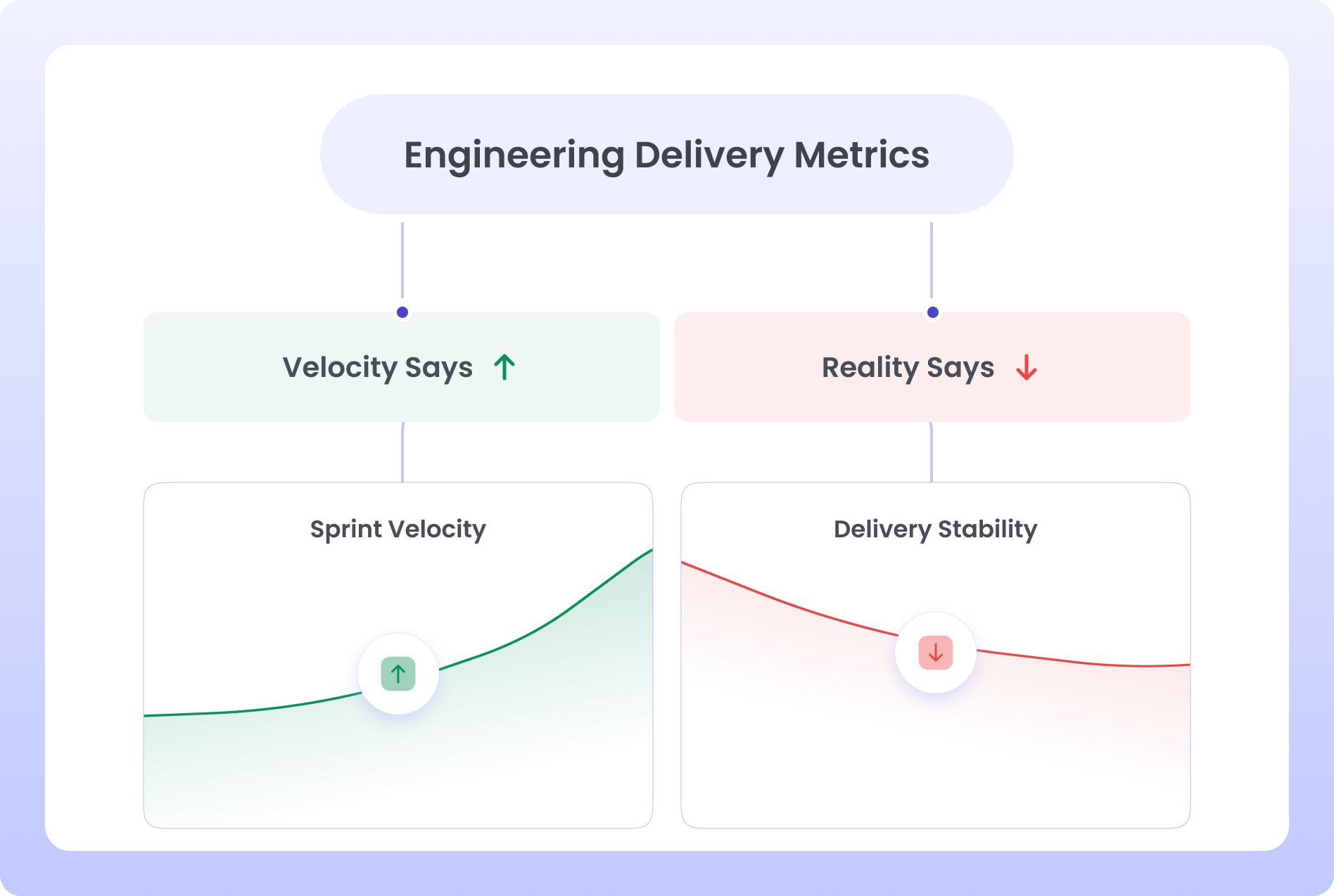
Sprint Velocity: What It Tells You, What It Hides, and What to Use Instead
Sprint velocity is the most visible and most misused metric in software delivery. It was designed as a planning tool: a way for a team to estimate how much work it can absorb in the next sprint based on what it completed in the last few. That is the entire job description.
At some point, it became a performance metric. Managers started asking why velocity was not trending upward. Business stakeholders started using it to compare teams. Engineering leaders started treating it as a proxy for productivity. And the moment that happened, teams started gaming it.
The gaming mechanisms are well-documented. Teams inflate story point estimates to make commitments look safer. They move easy tickets into a sprint and defer complex ones to protect their velocity number. They mark tickets as complete before they fully meet the Definition of Done. The outcome: a velocity number that rises while actual delivery quality and predictability decline.
What Velocity Does Tell You
Velocity is still useful for one thing: internal sprint forecasting for a stable team. If your team has been running consistent sprints for at least three months with low turnover and consistent work types, your average velocity plus variance gives you a reasonable planning window for the next two to three sprints.
That is a narrow but real use case. If your team is growing, changing, or working on diverse types of work, velocity's signal-to-noise ratio drops fast.
Better Alternatives to Velocity as a Performance Signal
We've seen teams make the transition from velocity-as-performance to outcome-based measurement in a few consistent stages. The starting point is usually replacing the velocity trend line with a small set of metrics that can't be easily gamed.
How to Build a Delivery Metrics Stack for Your Org Size
The metrics that matter at 15 engineers are not the same ones that matter at 500. Smaller teams have enough direct observation to fill gaps in measurement. Larger organizations need instrumentation to surface what leadership cannot see directly.
Here is how we see the metrics stack evolve across org size, based on patterns across teams of all sizes.
Early-Stage Teams (15-50 Engineers)
At this stage, you are establishing baselines, not optimizing. Cycle time and deployment frequency give you a starting picture. Sprint completion rate tells you whether your planning process is working. Rework rate tells you whether velocity gains are real or borrowed.
Do not instrument everything at once. Pick two throughput metrics and one predictability metric. Run them for a full quarter before adding more. Your goal is building measurement habits, not building a dashboard.
- Cycle time per ticket type (features vs bugs vs tech debt)
- Deployment frequency (weekly is fine at this stage)
- Sprint completion rate
- Rework rate (track manually in Jira with a 'hotfix' label if tooling is not in place)
Scaling Teams (50-200 Engineers)
This is where most measurement programs break down. You have enough teams that aggregate metrics hide team-level problems, but not enough process maturity to run sophisticated analytics. The priority is segmentation.
You need per-team metrics, not just org-level numbers. A 10% improvement in org-level cycle time could mean two high-performing teams masking three struggling ones. Hivel's Investment Profile is useful at this stage specifically because it breaks down where time goes at the team level without requiring manual tagging.
- Cycle time segmented by team and work type
- Lead time for changes (Git to production)
- Unplanned work rate per team
- Sprint completion rate by team
- DORA deployment frequency and change failure rate at org level
Enterprise Teams (200+ Engineers)
At scale, delivery metrics become a cross-functional conversation. Your CTO needs board-level visibility. VPs need team health views. EMs need enough granularity to run effective retros.
Klenty ran this transition explicitly, tracking metrics across layers of the organization. The result was 49% more features shipped, 25% reduction in cycle time, and 22% reduction in review time. The leverage was not in any single metric but in connecting the SDLC layers that were previously invisible to each other.
Recalibrating Delivery Metrics in an AI-Assisted Engineering Environment
The 2025 DORA report's headline finding was this: AI adoption improves throughput and worsens delivery stability. That is not a reason to slow AI adoption. It is a reason to update your measurement framework before your AI tooling outpaces your observability.
A 25% increase in AI tool adoption, per DORA 2024 research, correlates with a 3.1% improvement in code review speed and a 7.2% decrease in delivery stability. Speed goes up. Quality control stress goes up with it. If you are only tracking deployment frequency, you are seeing the first number and missing the second.
The Metrics That Change When AI Enters Your Stack
Three metrics behave differently in AI-assisted delivery environments. Cycle time can compress dramatically at the coding stage while the review stage expands. Deployment frequency can increase while rework rate increases in parallel. AI code acceptance rate (suggestions accepted) looks impressive while the production-merged rate tells a very different story.
On the last point: across orgs that have deployed AI coding tools, acceptance rate averages high. The production-merged rate is closer to 18%. Most accepted suggestions get caught in review, modified before merge, or reverted after production incidents. If your AI adoption metric is acceptance rate, you are measuring the wrong thing.
Common Mistakes Engineering Leaders Make When Setting Up Metrics
Getting delivery metrics wrong is not just an inconvenience. It erodes trust between engineering and the business, creates perverse incentives on your teams, and can take a year or more to unwind once the wrong metrics become entrenched in your reporting cycles.
Mistake 1: Treating Metrics as Goals
The moment you say 'our goal this quarter is to reduce cycle time by 20%,' cycle time becomes gameable. Teams start avoiding complex tickets, breaking work into artificial sub-tasks, or moving the 'in progress' timestamp to the last possible moment before a ticket ships.
Use metrics as diagnostic signals, not targets. The goal is shipping better software more reliably. The metric tells you whether you are moving in the right direction.
Mistake 2: Tracking Too Many Metrics at Once
A dashboard with 14 metrics signals nothing. If everything is tracked, nothing is prioritized. Most effective delivery measurement programs start with three to five metrics, get clean data for a quarter, and only add more when the existing signals stop surfacing new information.
The right starting set: cycle time (per ticket type), sprint completion rate, rework rate, and deployment frequency. That is four metrics covering flow, predictability, quality, and throughput. Instrument those first.
Mistake 3: Comparing Metrics Across Teams
Cross-team velocity comparisons are the most common way engineering leaders accidentally destroy team morale. A platform team working on infrastructure has fundamentally different cycle times than a product team shipping user-facing features. Comparing them using the same metrics is not just meaningless; it is actively misleading.
If you need cross-team comparisons, use them on process health indicators (sprint completion rate, unplanned work absorption, rework rate) rather than throughput indicators (velocity, features shipped). Process health is more comparable across team types.
Mistake 4: Missing the SDLC Layers You Don't Instrument
Code review time and deployment frequency are easy to measure. The waiting time between steps in your SDLC is not. Most organizations have significant latency in their delivery pipelines that never shows up in standard reporting because nobody has instrumented the handoffs.
The delay between a ticket being marked 'QA Ready' and a QA engineer picking it up. The time a PR sits unreviewed because the right reviewer is context-switching. The deployment window that only opens twice a week because nobody has automated the gate. These are the real delivery constraints for most scaling teams, and they are invisible without deliberate instrumentation.
Mistake 5: Building Metrics Dashboards Before Fixing Data Quality
This is the mistake that kills most analytics programs. You buy a tool, connect your Jira and GitHub, and the dashboard shows you numbers. Some of those numbers are wrong because tickets were closed without time-tracking, PRs were merged to non-standard branches, or your deployment pipeline is partially instrumented.
Wrong data in a dashboard creates false confidence. The VP sees a cycle time of 4.2 days and feels good. The engineering team knows the real number is closer to 9 days because the 4.2 excludes tickets that got stuck in a waiting state that was never tracked.
Fix data quality first. For Jira: define your workflow states explicitly, enforce required fields on ticket close, and standardize your ticket types. For Git: define what counts as a production deployment and instrument it consistently. Only build dashboards on top of clean data.
Frequently asked questions
What are engineering delivery metrics?
Engineering delivery metrics are quantitative signals that measure how reliably and efficiently a software team moves work from development to production. The most important categories are throughput metrics (how much is shipping), flow metrics (where time goes in the SDLC), predictability metrics (how reliably a team meets its commitments), and stability metrics (how often shipped work breaks in production). Used together, they give engineering leaders a complete picture of delivery health.
What is the difference between throughput and velocity in software delivery?
Throughput is an objective measure of how many work items are completed in a given time period. Velocity is a team-specific estimation unit (story points per sprint) that is useful for sprint planning but unreliable as a performance or comparison metric. Throughput is harder to game because it is tied to actual completed work. Velocity is easy to inflate by adjusting story point estimates. For delivery performance measurement, throughput metrics like features shipped per sprint or deployments per week are more reliable signals.
How do you measure predictability in software delivery?
Delivery predictability is measured through sprint completion rate (what percentage of committed scope actually ships), velocity variance (how much output swings sprint over sprint), and unplanned work rate (what percentage of sprint capacity gets absorbed by work that was not in the original plan). A team with a sprint completion rate above 85% and a velocity coefficient of variation below 20% is operating predictably. Erratic swings between high and low output sprints indicate a planning or capacity problem even if average output looks healthy.
Is sprint velocity a good measure of engineering productivity?
No. Sprint velocity is a planning tool, not a productivity metric. It measures estimation units per sprint, not customer value delivered. When velocity is used as a performance indicator, teams game it by inflating estimates or prioritizing easy tickets. It also cannot be compared across teams because each team defines story points differently. Better proxies for productivity include cycle time per work type, sprint completion rate, and feature throughput per sprint.
What metrics should I present to the board about engineering delivery?
Board-level engineering delivery reporting should focus on three things: feature output trend (are we shipping more customer value over time), delivery reliability (are we hitting our commitments), and delivery quality (is what we ship staying stable in production). The specific metrics that support these narratives are: feature throughput trend (quarter over quarter), sprint completion rate, and rework rate or change failure rate. Avoid presenting DORA scores in isolation to non-technical audiences; translate them into business-language proxies.

Reveal Invisible Roadblocks
Uncover hidden productivity bottlenecks in your development workflow
Review Efficiency
Streamline code review processes to improve efficiency and reduce cycle times


"The only tool our entire leadership team actually trusts"


